Wearing These Colors Might Be Doing You More Harm Than Good
You may choose your color outfit for the day based purely on shades you like and don't like. And that's absolutely fine. Many of us choose our clothes depending on personal preference, and then wear them for occasions we think they'd be the most flattering for, and there really is nothing wrong with that.
But, delving a little deeper into our wardrobes, there may be more to it when it comes to picking out an outfit — and particularly the colors you're reaching for. This concept is called color psychology, and it's been used over the years to determine what outfits are telling people about us, before we even open our mouths. "Color psychology affects perception, even when we don't realize its influence," Snagajob's career experts explained to PureWow. "Colors send subconscious messages, and can affect your mood, as well as the mood of the workers around you," Sheila Dicks, professional style coach and founder of the Fashion Expert Network, added to AOL. However, it's worth noting a lot of that association is down to the personal preferences and experiences of the people viewing them.
You may already know a few of these associations, such as red representing love and passion, or black representing sadness and mourning. But it turns out there are some associations you may never have thought about, and wearing them on the wrong occasion may be doing you more harm than good.
Orange may be part of the reason you didn't get that job
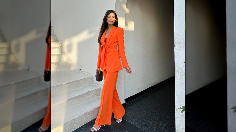
Ready for a new chapter in your life with a new career? Then you should maybe steer clear of the color orange. Though the shade can be a fun one for a day out with your friends in the summer, when it comes to work, there's research to suggest it's probably one to avoid when you're trying to impress a potential new employer. "While orange might be your favorite color, on the receiving end, orange can unintentionally communicate that you are an attention-seeking, over-confident candidate," Snagajob's experts explained to PureWow.
According to Sherry Maysonave, head of Empowerment Enterprises, wearing pretty much anything but orange could give you a better chance of getting the job before you even speak. "That first impression on an interview counts so much, and you don't want to be out of the race before the interview even begins," she told StyleCaster. "That [impression] happens in less than 30 seconds and it's based entirely upon your attire." Who knew?
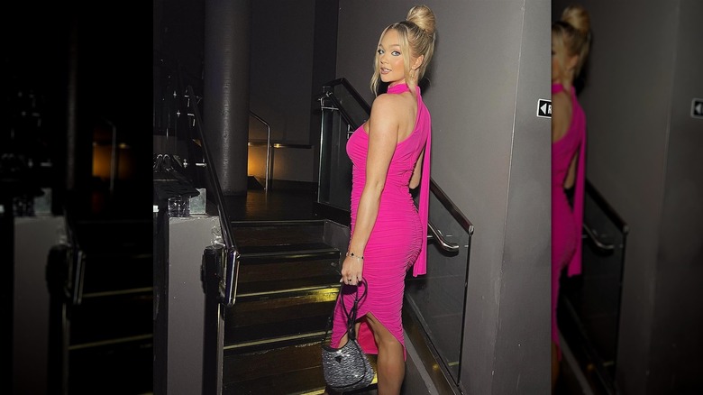
While red could send the wrong impression at a wedding
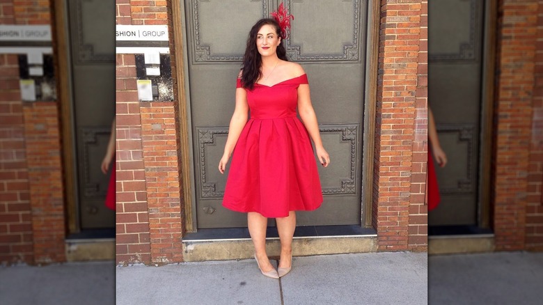
We all know that you should never wear white to someone else's wedding, but it turns out red isn't exactly a go-to color for a wedding guest, either. That's because the color can have certain connotations when wearing it on someone's special day. One of the biggest? That whoever is wearing it is trying to steal attention away from the happy couple. "I feel like red can be seen as like quite sexy. Naughty," wedding planner Bethany Smith claimed on "The Unfiltered Bride" podcast. Micaela Erlanger, a celebrity stylist and bridal fashion expert, also nixed red as a wedding guest color when speaking to Who What Wear UK, noting, "This color is too strong and harsh and could distract in photos, ultimately taking the attention away from the guests of honor and the couple."
There's even an old wives' tale about someone who wears red to a wedding that we're guessing most people will want to avoid. Wedding planner Georgie Mitchell claimed on "The Unfiltered Bride" that it was once believed someone who wore red to someone else's wedding had actually slept with the groom. Really. Of course, attitudes have changed a lot since then, but, when there are so many other stunning shades out there, you may still want to avoid red to be on the safe side.
Light blue may not be the shade for you when chatting online
Another color that may be worth avoiding? Light blue. Though this shade can be absolutely gorgeous in real life (and particularly flattering for those with cooler undertones), it's probably one to stay away from if you take a lot of Zoom calls. The reason is that light blue doesn't always read on a camera the same way it does in real life. "Webcams don't catch color the way our eyes do in person, so light blue may wash out," Snagajob explained to PureWow. That means if you do a lot of work meetings via video call, you'll probably want to save your light blue looks for the evenings and weekends.
So, what should you wear if you spend a lot of time chatting away on camera? A deep blue is a good choice, according to Snagajob, because it has strong connotations and will pick up on camera. "[It] conveys trust, responsibility, and team spirit," they shared.
But light pastels or white outfits could be why your photo shoot didn't end too well
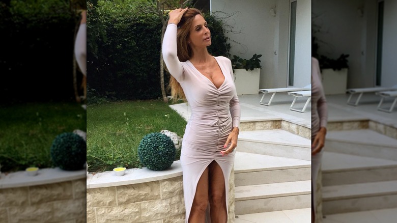
Similarly to keeping the light blue clothing away from the camera, for still photography, if you have light skin with cool undertones, it may be a good idea to stay away from pale pastels and chic all-white outfits. As Lee Eiseman, the executive director at Pantone Colour Institute, explained to Who What Wear UK, "Very pale pastels and whites can make the subject look washed-out." That's because when you're having a photo taken with flash or other professional lighting, these shades can sometimes end up blending in too much with your skin tone.
Another color to stay away from when it comes to having your photo taken? A nude shade that matches your skin tone a little too well. On first look, something so similar to your skin might actually make you look like you're literally nude under the wrong lighting. And that's probably not what you want when you were hoping for some cute snaps for Insta or looking to get some wholesome family photos.
Wearing brown may be giving the wrong impression at work
If you work in a fast-paced environment that's on the cutting edge of technology and very driven in moving forward, then you may want to nix the brown clothes from your work wardrobe. New York image and style expert Carol Davidson explained why to Fast Company, sharing that the muted shade has certain connotations that may not be doing you any favors in your career. "Like every color, brown does have some positive attributes; it can read comforting and reliable. But in an industry that is fast-paced and innovative it may give the impression you're staid and passive," Davidson explained.
Though brown has no doubt had a bit of a resurgence, especially in the fashion world, it has a bit of a reputation for not being that exciting. It may even be thought of as dull or dated in some circles. That's why you're probably best to swap this one for a shade that's a little brighter if you're looking to give off a more exciting, going-places vibe.
And wearing too much black may be giving you creative block
If you're looking to get your imagination running, you may want to avoid wearing black (or anything too dark, for that matter) while attempting to get those creative juices flowing. That's because there's research to suggest that wearing colorful clothes can actually make people feel more creative over darker shades like black or navy blue. In fact, Stitch Fix UK, an online personal styling service, conducted a survey in the UK that found that 35% of people surveyed felt they had a surge in creativity when they were wearing colorful clothes.
That may come as a surprise to some, seeing as so many creative people in the public eye seem to favor wearing all-black outfits. Though, at least according to Kathryn Watson, an arts professor at MSU Denver, that may come more out of a desire to be timelessly chic. "I do think to one extent or another, black will always be classic in some way, and I think that's part of the appeal," she told Met Media.
Black could also be contributing to your bad mood
Of course, the color you're wearing can only do so much to pep you up when you're in a bad mood. But it turns out that by simply not wearing black, many people can see an increase in their happiness levels. In a Stitch Fix UK survey of 2,000 British people, it was discovered that one in three respondents actually decided to dress in colorful clothing in an attempt to boost their mood. The notion is called dopamine dressing, and it involves staying away from dark colors like black or navy and instead choosing bright shades like pinks, yellows, or reds that may evoke memories of happier times.
"Dopamine dressing is an idea born from one of the core principles underpinning our motivations to wear certain clothes — to satisfy our emotional needs. When you wear something you love that holds symbolic value, your confidence increases and you feel happy," Shakaila Forbes-Bell, fashion psychologist and founder of Fashion is Psychology, explained to Independent. "That happiness stems from a neurotransmitter called Dopamine that meditates in the brain – when it's released, we experience feelings like pleasure, motivation, and satisfaction."
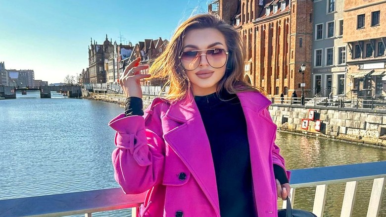
Whereas magenta could be keeping you from feeling a sense of calm
Though magenta is seen as a traditionally feminine color as it's commonly linked to pink, in reality, it has some pretty violent connotations. "Different from pink, magenta was named after a bloody battle," Michelle Lewis, a color psychology expert and the founder of The Color Cure, explained to Business Insider. The battle actually took place during the Second Italian War of Independence, in which thousands of people died. That's why the color may have an association with strength, vibrancy, and energy for many people — not exactly what you're looking for when you want some serenity.
Whatever color you find yourself wearing though, it's always worth noting that a lot of the emotion you and those looking at you get from the colors will be totally dependent on personal feelings and experiences. As color psychologist Karen Haller told Harper's Bazaar, "We have our own perceptions for different colors and what they mean to us, whether that's positive or negative. It depends on you as a person and your behavior towards the color."